Want to start trading stocks but feel overwhelmed by charts? Here’s what you need to know:
Stock charts are visual tools that show a stock’s price and trading volume over time. They help you spot trends, find buying or selling opportunities, and understand market sentiment. Whether you’re investing in SGX-listed companies or international stocks, mastering stock charts is key.
Here’s a quick breakdown of what you’ll learn:
- Why stock charts matter: Use them to analyse price patterns and trading volumes for better decisions.
- Types of stock charts: Line, bar, and candlestick charts – each serves different needs.
- Key chart elements: Understand price axes, timeframes, volume indicators, and data points like opening/closing prices.
- Candlestick basics: Learn how bullish/bearish candles and wick-to-body ratios reveal market sentiment.
- Chart patterns: Identify reversal and continuation patterns to predict price movements.
- Technical indicators: Tools like moving averages, RSI, and VWAP refine your analysis.
- Beginner mistakes to avoid: Misreading low-volume stocks, ignoring currency changes, and using the wrong timeframes.
- Practical tools: Platforms like Thinkorswim, Koyfin, and TradingView simplify chart analysis.
Stock charts simplify complex market data, giving you the confidence to trade smarter. Ready to dive in? Let’s break it down step by step.
How to Read a Stock Chart (Beginner’s Guide)
Basic Parts of Stock Charts
Stock charts are packed with essential details that help you understand a stock’s price movements and trading activity. As Han-Sheng Chen puts it:
“Stock charts simply give you a visual representation of changes in share price and trading volume. They cut through all the rumors, headlines, hype and fear. They paint an objective picture of what is really going on with the market and individual stocks.” [1]
These foundational elements are the building blocks for deeper analysis, which we’ll explore in later sections.
Price and Time Axes
The vertical axis (Y-axis) on a stock chart represents the stock’s price, typically shown in Singapore dollars (SGD) for SGX-listed companies. This axis starts at the lowest price at the bottom and increases as you move upward. The scale adjusts dynamically based on the selected price range and timeframe [4].
Meanwhile, the horizontal axis (X-axis) tracks time, with the latest price data displayed on the far right [3]. You can customise the timeframe to suit your trading or investing goals – whether you’re focusing on intraday activity, daily changes, weekly trends, or even monthly patterns. For example:
- Intraday charts: Ideal for short-term trading.
- Weekly or monthly charts: Better for identifying long-term trends.
Keep in mind that the SGX operates approximately 20 trading days a month and 252 days a year [3]. Together, these axes help you pinpoint not just how much a stock’s price has shifted, but also when those changes occurred. This timing insight is crucial for evaluating the strength and durability of price trends [4].
Volume Indicators
At the bottom of most stock charts, you’ll find volume bars, which show the number of shares traded during each time period. These bars are a visual representation of the buying and selling activity behind price movements [6].
- High volume indicates strong interest and liquidity in a stock.
- Low volume suggests limited market participation [5].
On the SGX, stocks trading over 500,000 shares per day are considered high-volume stocks [5]. The relationship between price and volume is particularly telling. For instance, significant price movements accompanied by high volume signal genuine market interest, while similar moves on low volume may indicate temporary or speculative activity. Volume also plays a key role in confirming breakouts, spotting reversals, and determining the best times to enter or exit a position [5].
Key Data Points
Stock charts also display several crucial data points that provide deeper insights into market sentiment:
- Opening price: The price at which trading begins for the session.
- Closing price: The final price at the end of the session.
- High and low prices: The full range of trading activity during the period [2].
Another useful metric is the 52-week high and low, which highlights the highest and lowest prices a stock has reached over the past year [2]. Additionally, market capitalisation – calculated by multiplying the stock’s price by its outstanding shares – offers context about a company’s size and standing in the market [2]. For example, this helps differentiate between a blue-chip stock like DBS Group Holdings and a smaller, emerging company.
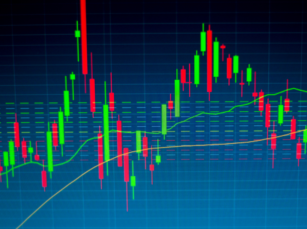
How to Read Candlestick Charts
Candlestick charts simplify complex price data into an easy-to-read visual format. As Steve Nison famously said:
“Candlesticks key you into what traders and investors are thinking at any given time.” [8]
Developed in 18th-century Japan by rice trader Munehisa Homma [7], these charts remain a go-to tool for analysing SGX stocks today.
Parts of a Candlestick
Every candlestick represents four key price points: the open, high, low, and close [7]. Together, these elements tell the story of price movements during a specific trading period.
- The real body – the rectangular section of the candlestick – shows the range between the opening and closing prices [7].
- Shadows (or wicks) extend above and below the body, marking the highest and lowest prices reached during the session [7].
For instance, if Singapore Airlines opened at S$5.50 and closed at S$5.60, the body would reflect this range. However, if the stock briefly peaked at S$5.75 before retreating, the upper wick would capture that high point.
The colour of the candlestick reveals price direction. A green or white candle indicates a bullish session, where the closing price is higher than the opening. Conversely, a red or black candle signals bearish movement, with the closing price falling below the opening [7].
Bullish vs Bearish Candles
Understanding the difference between bullish and bearish candlesticks helps gauge market sentiment.
- Bullish Candles: These form when buyers dominate, pushing the closing price above the opening price. They appear green or white [9]. A series of bullish candles on a stock like CapitaLand Investment could indicate rising investor confidence and upward momentum.
- Bearish Candles: These occur when sellers take control, resulting in a closing price lower than the opening. They are red or black [9]. This pattern reflects selling pressure, suggesting that supply is outpacing demand.
The size of the candlestick body also matters. Long bodies signal strong buying or selling pressure, while short bodies often reflect indecision [7]. For example, a long green candle on high volume suggests significant buying interest, whereas a small body with long wicks might indicate uncertainty about the stock’s direction.
Bullish patterns frequently appear after a downtrend, hinting at a possible reversal. On the other hand, bearish patterns often follow an uptrend, signalling potential resistance [9]. As Steve Nison puts it:
“Each candlestick is a simple, yet powerful tool to understand what’s happening in the market.” [10]
Wick-to-Body Ratios
The proportion between a candlestick’s wicks and its body provides additional clues about market sentiment.
- A long upper wick shows that buyers initially drove prices higher, but sellers regained control and pushed prices back down [11]. For example, if Genting Singapore shows this pattern near a resistance level, it may indicate growing selling pressure.
- A long lower wick suggests that sellers pushed prices down early, but buyers stepped in to recover the losses [11]. This often signals strong buying interest near a support level.
When the wick is two to three times longer than the body, it’s considered a long wick [12]. Such patterns often indicate price rejection at certain levels. A small body with long wicks typically reflects market indecision [11]. In these cases, it’s best to wait for the candle to close before acting, as premature decisions could be based on incomplete data. Additionally, spikes in trading volume can validate the significance of these wicks, often pointing to heightened market activity at those price levels [11].
Mastering these candlestick basics lays the groundwork for identifying larger chart patterns and trends.
Basic Chart Patterns
Chart patterns create specific price formations that can help predict future movements in SGX-listed stocks [13]. These patterns fall into two main groups: reversal patterns, which signal a change in trend, and continuation patterns, which suggest the current trend will resume after a brief pause [14]. When combined with the basic chart elements mentioned earlier, these patterns provide traders with more advanced signals to act on.
Reversal Patterns
Reversal patterns highlight a weakening trend and the potential start of a new one [16]. These patterns are valuable for identifying market turning points, helping traders decide when to enter or exit trades.
One of the most dependable reversal signals is the Head and Shoulders pattern. In an uptrend, this pattern forms with a left shoulder, a higher head, and a right shoulder. When the price breaks below the neckline, it often signals a reversal [16].
Other reversal patterns include:
- Double Tops: These suggest a price decline after the formation of two high points.
- Double Bottoms: These indicate the end of selling pressure and the likelihood of an uptrend [15].
To avoid false signals, confirm these patterns by checking support and resistance levels [15]. Traders can act when the price breaks the neckline, confirming the reversal, or wait for a pullback to the neckline or key levels for additional confirmation [16].
Volume plays a critical role in validating these patterns [16]. Larger reversal patterns, which may take weeks or even months to develop, often result in more significant price movements [16].
While reversals focus on trend changes, continuation patterns focus on brief pauses before the trend resumes.
Continuation Patterns
Continuation patterns signal a temporary break in an existing trend, suggesting that the trend will likely continue [17][18]. These patterns are especially useful for traders looking to join a trend after a brief consolidation phase.
Here are some common continuation patterns:
- Triangles: These can be ascending, descending, or symmetrical, and they show temporary consolidation before the prevailing trend resumes [17][19].
- Flags and Pennants: Flags are marked by parallel support and resistance lines, while pennants have converging trendlines resembling small symmetrical triangles. Both signal brief pauses in strong trends [18].
- Rectangles: These form when prices move sideways between clear support and resistance levels, eventually breaking in the direction of the existing trend.
Before acting on these patterns, ensure the trend is strong. Use tools like moving averages, trendlines, and momentum indicators to confirm trend strength. Look for strong moves beyond key support or resistance levels, ideally confirmed by candle closes and volume spikes [17].
For risk management, place stop losses just outside the pattern’s boundaries – below support for bullish setups or above resistance for bearish ones [17]. To estimate profit targets, measure the pattern’s height and project it from the breakout point [17].
False breakouts can be a challenge in pattern trading. To minimise this risk, confirm breakouts with volume and wait for candle closes. This approach helps filter out temporary price spikes and ensures you’re acting on genuine breakouts rather than false alarms.
Technical Indicators for SGX Traders
Chart patterns can hint at potential price movements, but technical indicators take it a step further by offering measurable insights. These tools, derived from price and volume data, help traders better understand market conditions and refine timing. For those trading SGX stocks, knowing how to use these indicators can significantly improve decision-making.
That said, technical indicators are most effective when paired with other analysis methods rather than used on their own [20]. The key lies in choosing indicators that align with your trading style and goals, while also understanding how they work and their limitations.
“Accuracy of indicators is never an issue, they work as they are designed to work, problem is do you really understand how to use them.” – Max Newone, Works at National Stock Exchange (NSE India) [21]
Let’s take a closer look at three essential indicators – moving averages, RSI, and VWAP – and how they can complement chart patterns in SGX trading.
Moving Averages
Moving averages simplify price data, helping traders identify trends by smoothing out daily fluctuations [24]. On the SGX, the 50-day and 200-day simple moving averages (SMA) are particularly useful for spotting long-term trends and key support or resistance levels.
If you’re looking for quicker signals, the Exponential Moving Average (EMA) might be the better choice. It gives more weight to recent prices, making it ideal for short-term trends (e.g., 9-day or 21-day EMA). Meanwhile, the 50-day and 200-day SMA are better suited for long-term analysis [22][25].
A common signal to watch for is the golden cross, where a shorter moving average crosses above a longer one, indicating a potential bullish trend. Conversely, when prices fall below a moving average, it often signals a downtrend.
For instance, institutional traders often pay close attention to how stocks like DBS Group Holdings interact with their 200-day moving average. When prices approach this level, trading activity often increases as investors reassess the stock’s long-term outlook.
Now, let’s dive into the RSI, a momentum oscillator that adds precision to entry and exit points.
Relative Strength Index (RSI)
The RSI measures market momentum by comparing recent gains to losses, generating a value between 0 and 100 [24]. When the RSI rises above 70, it signals overbought conditions, while a drop below 30 suggests the stock may be oversold [24].
RSI is even more powerful when combined with other tools. For example, RSI divergence – where the price hits new highs but the RSI doesn’t – can hint at a weakening trend and a possible reversal.
This indicator can be particularly helpful during Singapore’s trading hours, where lower trading volumes are common. RSI helps identify when a stock may be overextended, signalling a potential pullback or rebound.
While RSI focuses on momentum, VWAP zeroes in on intraday price fairness, offering another layer to your analysis.
Volume-Weighted Average Price (VWAP)
VWAP calculates the average price of a stock, weighted by volume, over a trading day. This makes it a valuable tool for intraday traders looking to gauge a stock’s fair value on the SGX [25].
VWAP works best on shorter timeframes, such as 1-minute, 5-minute, or 15-minute charts, and helps traders identify buying or selling pressure. When prices trade above VWAP, it suggests upward momentum; prices below VWAP indicate selling pressure.
Traders often use VWAP breakout strategies, entering long positions when prices break above the VWAP line or short positions when they drop below it [23]. Similarly, VWAP bounce trades involve buying or selling when prices rebound off the VWAP line, treating it as a dynamic support or resistance level [23].
For heavily traded SGX stocks, VWAP serves as a reliable intraday reference. An upward-sloping VWAP signals growing buying pressure throughout the session, while a downward-sloping VWAP points to increasing selling pressure [26].
Master Systematic Trading with Collin Seow
Learn proven trading strategies, improve your market timing, and achieve financial success with our expert-led courses and resources.
Step-by-Step Chart Analysis
To build on the technical indicators we’ve discussed, let’s dive into a structured process for analysing charts. A systematic approach helps you cut through the noise and focus on what matters most for your trading decisions.
The secret? Start with the big picture before zeroing in on the details. This method is especially effective for SGX stocks, where trading volumes and market dynamics can differ from other exchanges.
Step 1: Identify the Main Trend
Begin by spotting the primary trend using weekly charts. Why weekly? They filter out daily fluctuations, giving you a clearer view of the market’s direction. Weekly line charts, in particular, are great for cutting through the clutter and identifying one of three trends:
- Uptrend: Peaks and troughs ascend, with each high and low higher than the last.
- Downtrend: Peaks and troughs descend, with both highs and lows progressively lower.
- Sideways trend: Prices move horizontally within a range, showing no significant upward or downward movement.
These trends often align with support and resistance levels. For example, in an uptrend, the line acts as support, while in a downtrend, it serves as resistance.
Step 2: Pinpoint Entry and Exit Points
Once you’ve identified the main trend, switch to daily candlestick charts to find entry and exit signals. This is where your knowledge of candlestick patterns and support-resistance levels becomes crucial.
Look for patterns like Doji, engulfing, or hammer formations. For instance, a bullish engulfing pattern near a key support level in an uptrend often signals a strong entry point. Similarly, moving average crossovers – like when the 50-day moving average crosses above the 200-day moving average (the “golden cross”) – can indicate bullish momentum.
Don’t forget to monitor the Relative Strength Index (RSI). If the RSI is above 70, the asset may be overbought, suggesting a potential sell signal. Conversely, an RSI below 30 could indicate oversold conditions, pointing to a possible buy opportunity.
Lastly, always set stop-loss and take-profit levels before entering a trade. This helps manage your risk, especially during Singapore’s trading hours when lower volumes can lead to increased volatility. Once your levels are set, confirm them with volume analysis to strengthen your decision.
Step 3: Validate with Volume
Volume is your final checkpoint. It confirms the strength and reliability of price movements. High volume, for example, indicates strong market participation, adding credibility to price trends. For SGX stocks, focus on stocks trading over 500,000 shares daily, as these tend to exhibit more reliable volume patterns.
Here’s a quick guide to interpreting volume alongside price action:
| Price Action | Volume Action | What It Means |
|---|---|---|
| Increasing | Increasing | Strong uptrend with solid market support. |
| Decreasing | Increasing | Strong downtrend, dominated by sellers. |
| Increasing | Decreasing | Uptrend losing momentum, potential reversal ahead. |
| Decreasing | Decreasing | Downtrend weakening, less conviction. |
For example, if you see a breakout above a key resistance level, check if it’s accompanied by high volume. High volume suggests the breakout is genuine and likely to continue. On the flip side, breakouts on low volume often result in false signals.
Volume can also serve as an early warning system. If a trend continues but volume starts to decline, it may signal a weakening trend and a potential reversal. This insight can help you adjust your position before the market turns.
Timing is everything. For SGX stocks, the morning session typically sees the highest volumes, offering better opportunities to confirm trends. Remember, volume often leads price – an increase in volume can signal significant price movements ahead, giving you a valuable edge in your trading decisions.
Common Beginner Mistakes to Avoid
Once you’ve nailed the basics of chart analysis, it’s crucial to steer clear of common mistakes that can derail your trading performance. Even with a solid understanding of fundamentals, new traders often stumble into predictable traps. These errors can turn potentially good trades into expensive lessons. Let’s explore some of the most frequent missteps – especially when trading SGX stocks.
Ignoring Currency Changes
Currency fluctuations often create an unseen layer of complexity that beginners might miss when analysing SGX charts. This can be a costly oversight, particularly when dealing with stocks that have significant international exposure or during periods of volatility in the Singapore dollar.
Currency movements can directly influence chart readings. For example, a strengthening SGD can squeeze earnings for Singapore-based companies with substantial US revenue.
“Relative currency values reflect the global flow of funds. When the dollar strengthens, it means more foreign money is flowing into the U.S. than the other way around.” – Rob Haworth, senior investment strategy director, U.S. Bank Asset Management [27]
Take early 2025 as an example, when the USD climbed to just above $1.02 per euro, marking its strongest position in over two years [27]. Such shifts can affect Singapore’s export-driven economy, creating chart patterns that might mislead traders focusing solely on price action. The savvy approach is to monitor recent SGD movements against major currencies before committing to trades involving internationally exposed SGX stocks.
Misreading Low-Volume Stocks
Volume plays a critical role in validating price movements, especially for stocks that trade at lower volumes. Beginners sometimes treat low-volume breakouts as if they were on par with those of highly liquid stocks. However, thin trading can lead to erratic price swings, producing dramatic candlestick patterns that lack the market support to confirm them.
When analysing low-volume stocks, pay close attention to volume data. It’s also wise to extend your analysis timeframe to smooth out sudden, irregular price movements.
Using Wrong Timeframes
Choosing the right timeframe is essential to match your trading style and filter out market noise effectively. Many beginners make the mistake of focusing on a single timeframe, overlooking the broader trends that become evident over longer periods [28].
Singapore’s trading hours (9:00 AM to 5:00 PM SGT, with a lunch break) can cause volume fluctuations that might distort short-term charts. Selecting an inappropriate timeframe could lead you to misinterpret these natural fluctuations as significant technical signals.
| Trading Style | Main Timeframe | Detail Timeframe | Best for SGX |
|---|---|---|---|
| Position Trading | Weekly | Daily | Long-term trends |
| Swing Trading | Daily | 4-hour | Medium-term moves |
| Day Trading | 1-hour | 15-minute | Intraday signals |
A good strategy is to use a primary timeframe for identifying trends and a secondary, shorter timeframe for finding entry points [28]. For instance, if you’re a swing trader focusing on daily charts, you might use weekly charts to confirm the overall trend and hourly charts for precise entry timing. This multi-timeframe approach helps you stay aligned with the primary trend and improves your trade execution. Sticking to a consistent timeframe combination, rather than jumping between intervals, also sharpens your pattern recognition and deepens your understanding of Singapore’s market dynamics [29].
Tools for Better Chart Analysis
Having the right tools can turn guesswork into a systematic approach when analysing SGX stocks. Singapore traders have access to a variety of platforms that can enhance their ability to interpret charts effectively. Let’s explore some essential platforms and techniques to sharpen your chart analysis skills.
Setting Up Trading Platforms
Thinkorswim is a feature-packed platform ideal for traders in Singapore. By opening a Schwab account, you gain access to Thinkorswim’s extensive technical tools, including over 400 technical indicators and highly customisable charts. This makes it a go-to choice for serious traders looking to refine their analysis [30].
For those seeking a simpler yet powerful alternative, Koyfin offers many of the capabilities of Bloomberg, tailored for individual investors. Stephen Chen, a Singapore-based investor, shares his perspective:
“Koyfin is one of the chief tools I use to get a quick overview of the markets, as it offers a great dashboard covering multiple asset classes across the globe. And because they also offer data and analysis on US-listed ETFs and funds.” [33]
Koyfin allows users to create custom watchlists and dashboards, focusing on SGX stocks and other relevant markets. You can tailor the interface to display the data most critical to your trading strategy [33].
If you’re looking for institutional-grade tools, AlphaSense stands out. Used by 88% of S&P 500 companies and 80% of top asset management firms, AlphaSense offers advanced analytical features. These can also be exported to Excel for deeper analysis [32].
For direct access to SGX data, consider the SGX Data Direct platform, which provides official market data, or use the Investor Portal through CDP for individual investors [31].
Using Price Alerts
Once your platform is set up, price alerts can help you monitor the market more efficiently. Research indicates that well-configured alert systems can reduce missed opportunities from 65% to 15% and cut screen time from 6–8 hours to just 2–3 hours per day [36].
Instead of constantly watching charts, you can set alerts for specific price levels, technical indicators, or market conditions. Platforms like TradingView and Thinkorswim offer robust alert features that notify you when your criteria are met [36].
To avoid overcomplicating things, limit your alerts to 3–5 key conditions per session [36]. Focus on meaningful trigger points that align with your entry and exit strategies. Always test your alerts in a simulated environment before relying on them for live trading [37]. Using alerts effectively can boost trading consistency from 40% to 85% and increase profit-taking success from 35% to 75% [36].
Testing with Past Data
To take your strategy further, backtesting with historical SGX data allows you to refine your approach without risking real money. This method helps you evaluate how your analysis would have performed under various market conditions.
Thinkorswim’s OnDemand feature acts as a market simulator, enabling you to replay past market scenarios with precision. You can choose specific dates from recent years to see how SGX stocks behaved, testing your analysis techniques against actual historical data [34].
Similarly, TradingView’s Bar Replay lets you step through past price movements. You can set parameters, simulate trades, and review results to fine-tune your strategy [35].
Regular backtesting not only helps you identify chart patterns that perform well in Singapore’s market but also builds confidence in your skills. This reduces the chances of errors when applying untested strategies in live trading environments.
Conclusion: Building Your Chart Reading Skills
Becoming proficient at reading stock charts takes time, patience, and consistent effort. By mastering price action, trends, and support/resistance levels, you can make more informed trading decisions in Singapore’s market.
Key Points to Remember
- Start with the basics: Price action, trends, and support/resistance levels are the foundation of chart analysis. Stock charts simplify market data, highlighting price movements and trading volume to reveal underlying trends.
- Stick to reliable patterns: Patterns like the double top, ascending triangle, and cup and handle have shown success rates of about 73–76% in real-world scenarios [38]. Focusing on these can improve your chances of success.
- Simplify your approach: Use a few core indicators, such as moving averages, RSI, and volume, to avoid overcomplicating your analysis. Combining technical and fundamental analysis often leads to better trading decisions.
Consistency is key – apply these principles regularly to sharpen your skills.
Next Steps
Now that you’ve got the essentials, it’s time to put them into practice. Start with demo trading to test your understanding without financial risk. Set realistic goals, stay disciplined, and revisit earlier concepts like trend analysis and candlestick patterns as you refine your techniques.
Consider enrolling in structured learning programmes to deepen your knowledge. For example, the Collin Seow Trading Academy offers specialised courses tailored for Singapore traders. These cover advanced chart patterns, SGX-specific strategies, and even mentorship to fast-track your progress.
Lastly, backtest your strategies using historical SGX data. This step not only validates your approach but also helps you identify which patterns work best in Singapore’s unique market environment. By doing so, you’ll build confidence and gain valuable insights into market behaviour before trading live.
FAQs
How do I choose the right stock chart for my trading style?
The best stock chart for you hinges on your trading style and objectives. Candlestick charts are a favourite among traders focused on short-term trends. They offer detailed insights into price movements over specific time frames, making them ideal for spotting patterns and quick shifts in the market. On the other hand, if you’re in it for the long haul, line charts might be a better fit. Their clean, straightforward design highlights overall price trends without the distraction of daily ups and downs.
For those who want a more detailed view of price action, bar charts are a versatile option. They show the open, high, low, and close prices, giving you a fuller picture of market activity that can suit various trading strategies.
The key is to choose a chart type that complements your trading approach, whether you’re targeting short-term gains or building a long-term portfolio. Don’t hesitate to try out different chart styles to see which one enhances your analysis and decision-making.
How can I confirm chart patterns and avoid being misled by false signals?
To avoid false signals when analysing chart patterns, it’s crucial to rely on multiple indicators and time frames. For instance, combining tools like trendlines, candlestick patterns, and volume analysis can provide a more accurate view of market behaviour. This method of cross-referencing prevents over-reliance on a single indicator, which might sometimes lead to misleading conclusions.
Equally important is patience. Wait for a clear confirmation of a breakout or trend reversal before acting. This could involve monitoring price movements over several days to ensure the trend holds steady. On top of that, always prioritise risk management strategies – like setting stop-loss orders – to safeguard your trades against sudden market shifts.
How do I use technical indicators like RSI and VWAP to improve my stock chart analysis?
Incorporating tools like the Relative Strength Index (RSI) and Volume Weighted Average Price (VWAP) into your stock chart analysis can refine your trading decisions. The VWAP represents the average price of a stock during the trading day, adjusted for volume, and is commonly used to pinpoint important price levels and trends. Meanwhile, the RSI tracks momentum, indicating whether a stock might be overbought or oversold, which can hint at possible price reversals.
Here’s an example of how you might use these indicators together: If the price consistently stays above the VWAP and the RSI hovers near 30, it could signal an oversold condition, making it a potential buying opportunity. On the flip side, if the price drops below the VWAP and the RSI nears 70, this may suggest an overbought condition, making it a good time to consider selling. By combining these tools, you can reduce the chances of acting on false signals and gain a more accurate understanding of market trends, ultimately enhancing your trading strategy.