5 Ways You can Accurately Identify The Start Of New Trends!
This is slightly different from predicting reversals, because to catch a reversal means the new trend hasn’t quite formed yet.
These are ways to identify when that new trend has just started and is ready to make a run for you to get in on the ride!
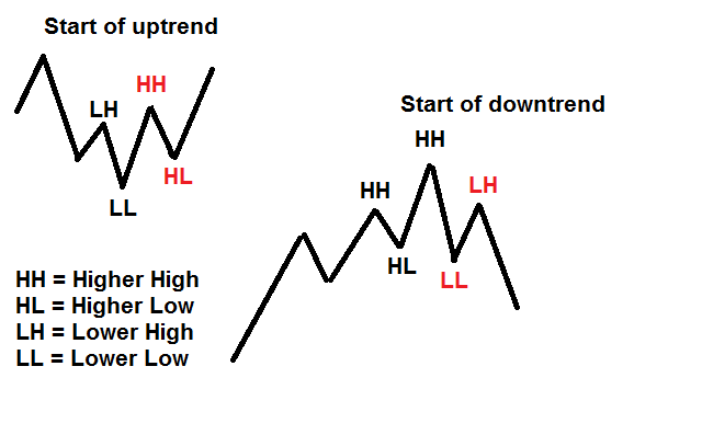
#1 HH-HL (Higher High Swing Point – Higher Low Swing Point)
This is the most raw form of identifying the start of a new trend. If you observe a higher high than the previous high, and a higher low than the previous low, you have the beginnings of a new uptrend. With the increased volatility in the markets, this also means it is prone to whipsaws. So one way you can filter out the whipsaws, is by identifying higher time frame swing points instead. High time frame characteristics tend to be more significant, these price points take longer time to form, which means more participants are paying attention to them.
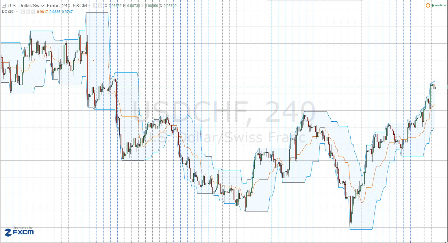
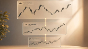
#2 Donchian Channels
This is a variation of the HH-HL method. Richard Dennis taught his famous turtle traders a strategy based on Donchian Channels. Donchian channels are made by observing the high and lows of the look back period. For example, a 20 period Donchian Channel will mark the high of the previous 20 days(excluding the current day) to be the high of the channel and the low of the previous 20 days(excluding the current day) to be the lower channel. So as price moves along, there will be a channel wrapping price. If price breaks one of the upper or lower boundaries, that indicates a start of a new trend.
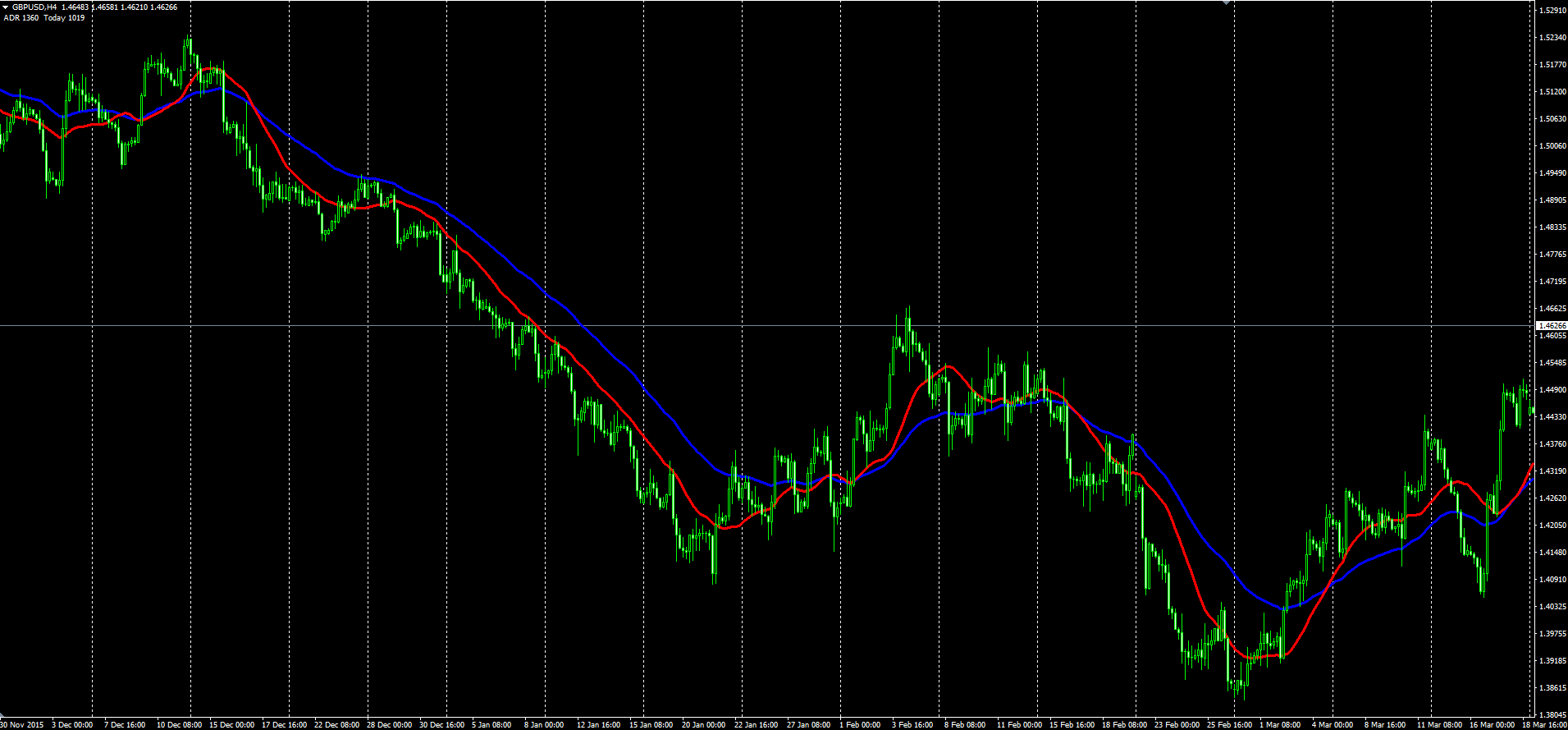
#3 Moving Averages
These simple and elegant lines are great for helping you identify a trend. It’s not difficult to observe if the moving average is sloping up or sloping down. Crossovers from a combination of a shorter term moving average and a longer term moving average can be a powerful combination to help you identify the start of new trends. Simple Moving Averages react slower to recent price movements, exponential moving averages react much faster. To reduce the number of crossovers, we can use a shorter term simple moving average and a longer term exponential moving average.
Moving averages also act as a form of dynamic support and resistance. So one way to filter out false signals, is to watch what price does after the crossovers. If price does a retracement to test the moving averages and then bounce off them, we have a stronger conviction that the new trend is holding.
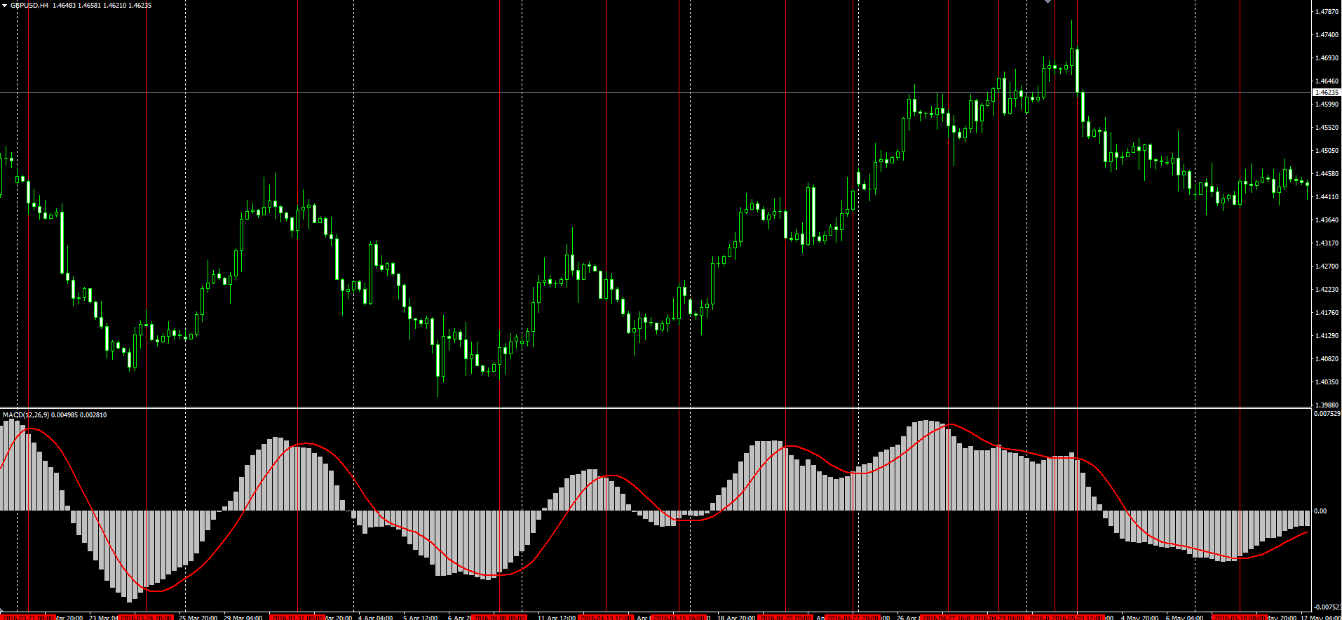
#4 MACD
The MACD line is a derivative of moving averages. It measures the distance difference between a short term moving average and a longer term moving average. So if the short term moving average is above the longer term moving average, the difference will be positive, and hence reflect a positive reading on the MACD. This positive reading represents an up trend and a negative reading represents a downtrend.
There is a another line of the MACD which is known as the signal line, it is the smoothened version of the MACD line. A crossover between the MACD and signal lines represent that a new trend has started. The smoothed signal line helps to reduce whipsaws.
Incidentally, this indicator can also be used to find reversals by identifying divergences with price.
Credits:
By Skbkekas – Own work, CC BY-SA 3.0, https://commons.wikimedia.org/w/index.php?curid=8779966
By Skbkekas – Own work, CC BY-SA 3.0, https://commons.wikimedia.org/w/index.php?curid=8779958
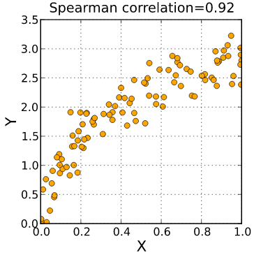
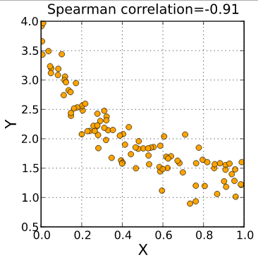
#5 Spearman’s Rank Correlation Coefficient
Last but not least, one of my favourite indicators for identifying which direction I should be trading in. This is a statistically derived value, between -1 and 1, based on a given set of data.
It basically measures the slope of the set of data when plotted on a graph. Think of your charts, don’t they look like graphs? This index is derived from the closing prices of the candles in your defined lookback period. Don’t use too short a look back period.
A measurement of +1 represents an uptrend of 45 degrees to the horizontal, while a -1 represents a downtrend of 45 degrees below the horizontal.
You can read more about the exact calculations here.
Naturally this is not something you calculate manually, there are softwares out there for this. But this is one good way you could tell a computer to quantify the strength and direction of a trend.
There will be whipsaws, no method is going to be right 100% of the time, but the ride makes it all worthwhile!
Good Trading Everyone!